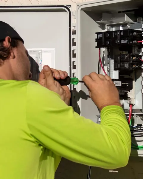
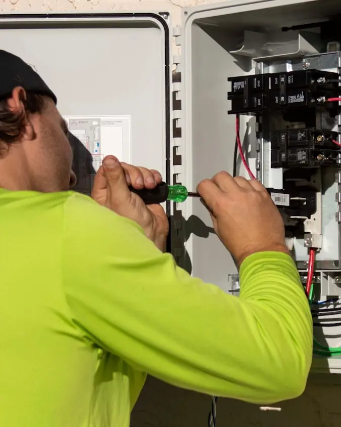
01 / RESIDENTIAL
FOR YOUR HOME
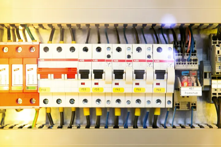
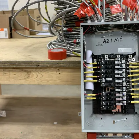
- Panel upgrades & service calls
- EV chargers and generators
- Troubleshooting, lighting, outlets
A concept exploring how an electrical contractor can look like a company that actually does the work — and let a homeowner and a facilities manager take completely different routes from the first screen.
Desktop home page — the full layout, rendered live rather than screenshotted.
Electrical contractors serve two customers who want opposite things. A homeowner with a dead outlet and a property manager scoping a tenant build-out need different language, different proof and different next steps. Most contractor sites flatten both into one list of services and then decorate it. This concept borrows its visual language from the trade instead: a job folder, a nameplate, a spec sheet. Photography carries the credibility, the type is condensed and utilitarian, nothing is rounded, and the audience split happens before anyone has scrolled.
Mobile home page
On a phone
The mobile view reorders the page around what someone actually does on a phone. What matters most on a laptop is rarely what matters most standing in a driveway, so the hierarchy changes rather than just the column count.
Interior page
The same page, rebuilt for a phone
Decisions
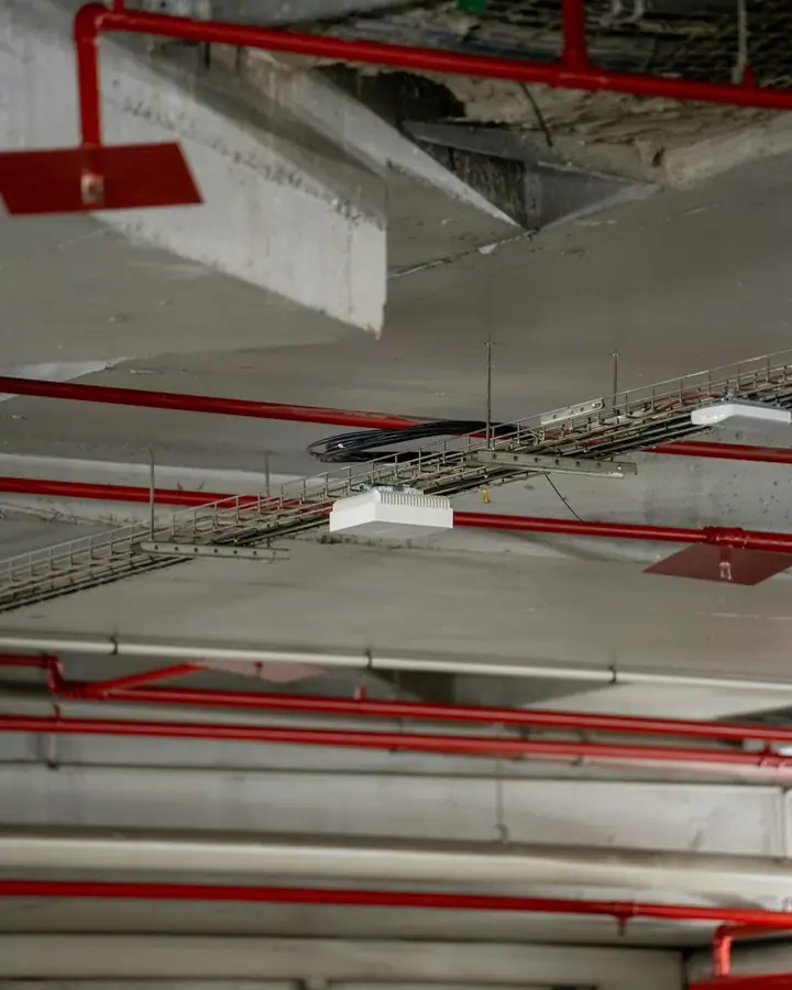
A full-bleed job-site image with the headline overlapping it, and a hard utility bar welded underneath carrying dispatch, licence and service area. Someone decides whether you are a real contractor in about a second, and a photograph of an electrician does that better than any arrangement of text.
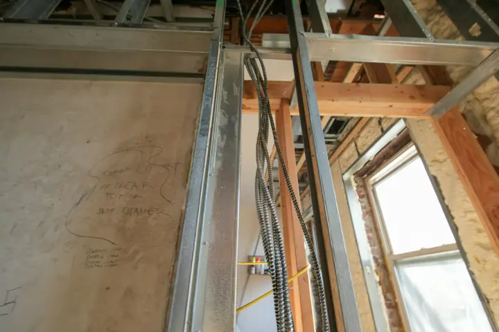
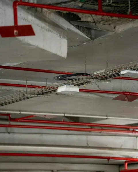
Immediately below the hero, the page splits into two half-width images — "For your home" and "For your building". Self-selection happens through pictures of the two kinds of work, so the visitor never reads a service list written for somebody else.
Eight capabilities as hairline-divided rows with a residential/commercial tag on each. A card grid would have implied eight equal things to browse; a numbered index implies a contractor who knows exactly what they do.
Licence number, insurance, bonding, EMR rating and apprentice count in a tabular block. For commercial buyers those figures are qualifying criteria, and putting them in a table rather than a badge graphic signals that they are facts, not decoration.
Barlow Condensed set in caps, charcoal alternating with bone, one safety amber. Every corner is square and every border is heavy. The restraint is what makes it read as equipment rather than software.
Northline Electric is not a real company and did not commission this project. It was built to work through a real problem — how a electrical contractor should present itself online — and everything shown is a genuine, complete design rather than a mockup of one. No performance figures are claimed, because there is no live site to measure.
Tell us what you do and what your current site is not doing. We will tell you what we would change.